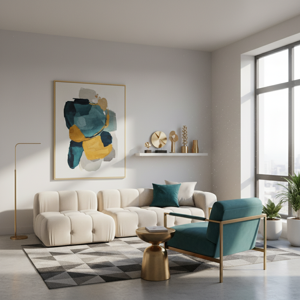
Ever walked into a modern living room and just felt… *right*? Like everything clicks, it’s stylish yet inviting, sleek yet cozy? Chances are, you’ve just experienced the magic of a beautifully balanced neutral and bold color scheme. It’s not just about picking pretty colors; it’s an art, a science, and frankly, a bit of a secret weapon for anyone wanting to create a living space that feels both cutting-edge and deeply personal.
As someone who’s spent countless hours poring over design magazines, experimenting with paint swatches, and yes, even repainting a wall (or two!) because the “bold” turned out to be “overwhelming,” I can tell you: getting this combination right is incredibly rewarding. It’s about creating a harmonious backdrop that allows personality to shine through, without making the room feel sterile or, conversely, too busy. Ready to transform your modern living room into a masterclass of color? Let’s dive in!
The Undeniable Power of Neutral & Bold Together
Before we pick up any swatches, let’s understand *why* this pairing is so effective, especially in a modern context. Modern design often leans into clean lines, minimalist aesthetics, and functional spaces. Neutrals (think whites, greys, beiges, greiges) provide that perfect serene canvas. They’re calming, create a sense of spaciousness, and offer incredible versatility. They’re the reliable friend that always looks good and gets along with everyone.
Now, imagine that calm, sophisticated friend suddenly putting on a vibrant, eye-catching scarf or a statement piece of jewelry. That’s your bold accent! It prevents the neutral space from becoming dull or flat, injecting energy, character, and a focal point. It’s the “oomph” that turns a nice room into an unforgettable one. From my experience, it’s this dynamic tension – the quiet strength of neutrals amplified by the confident pop of a bold hue – that truly defines a modern, sophisticated living room.
Building Your Foundation: Choosing the Perfect Neutral
This is where your journey begins. Don’t underestimate the power of neutrals; they are far from boring. The “right” neutral depends on several factors:
- Natural Light: Does your room get abundant natural light, or is it a bit darker? Cooler neutrals like light greys or crisp whites work wonderfully in well-lit, south-facing rooms, enhancing their brightness. In darker rooms, especially those facing north, warm neutrals like creamy whites, warm greiges, or beiges can prevent the space from feeling cold. I once painted a north-facing room a beautiful cool grey, only to realize it felt perpetually chilly. A shift to a greige with warmer undertones made all the difference!
- Existing Furniture & Flooring: Take a good look at your larger pieces – sofa, coffee table, bookshelves, flooring. Do they have warm undertones (think oak, warm leather) or cool undertones (grey fabric, black metal, cool-toned wood)? Your neutral wall color should complement these. If your sofa is a cool grey, a cool-toned white or a slightly deeper cool grey will likely look better than a creamy beige.
- Desired Mood: Do you want a truly airy and expansive feel? Crisp whites or very pale greys are your go-to. For a cozier, more grounded vibe, consider warmer greys, greiges, or light taupes.
My Tip: Always, always, *always* test paint swatches on your wall. Look at them at different times of the day, under various lighting conditions. What looks perfect in the store can look completely different in your living room.
The Pop of Personality: Introducing Your Bold Accent
Here’s where the fun really begins! This is your chance to infuse your personality and bring life to the neutral canvas. But how do you choose a bold color that doesn’t clash or overwhelm?
- Consider the Color Wheel:
- Complementary Colors: For a high-contrast, energetic look, choose a color opposite your neutral’s undertone on the color wheel. For example, if your neutral has warm yellow undertones, a deep blue or teal can be stuing.
- Analogous Colors: For a more harmonious, flowing feel, pick a bold color next to your neutral’s undertone. If you have a warm grey (grey with a hint of brown/red), a deep mustard yellow or a burnt orange could be beautiful.
- Monochromatic with a Twist: Use a deeper, richer shade of your neutral’s base color. A deep charcoal with a lighter grey, or a rich navy with a softer blue-grey.
- Current Trends vs. Timelessness: While it’s fun to follow trends (hello, emerald green!), remember that bold accents are easier to change than an entire wall color. If you’re drawn to a very trendy color, perhaps incorporate it through easily replaceable items like throw pillows, art, or smaller decor. For something more enduring, consider classic bold hues like navy blue, forest green, or even a deep terracotta.
- Where to Place the Bold: This is crucial. A bold accent doesn’t have to be a feature wall (though it can be!). Consider:
- Accent Furniture: A statement armchair, an ottoman, or a console table in your chosen bold hue.
- Textiles: Throw pillows, blankets, rugs, or curtains are fantastic ways to introduce bold colors. They’re also easy to swap out if your taste changes.
- Art & Decor: A large piece of art, vibrant vases, or unique sculptures can deliver that punch of color without overwhelming the space.
- Bookshelves: Arranging books by color, or adding bold decorative objects to shelves, can create surprising pops.
From my own experience, a little goes a long way. Start small. A single bold cushion can often reveal whether that color truly resonates with your space before you commit to larger pieces.
The Balancing Act: Embracing the 60-30-10 Rule (and Beyond)
You’ve likely heard of the 60-30-10 rule in interior design, and it’s a fantastic guideline for neutral and bold combinations:
- 60% Dominant Color: This is your primary neutral – the walls, large rugs, and major furniture pieces. It sets the overall mood.
- 30% Secondary Color: This could be another complementary neutral (e.g., a darker grey with a lighter white primary), or textures, wood tones, or even a very subtle, muted version of your bold color. It adds depth without competing with the primary.
- 10% Accent Color: This is your bold pop! Think cushions, artwork, decorative objects, or a single statement piece.
Now, this isn’t a strict mathematical equation. Think of it more as a visual proportion. The key is to ensure your bold color feels intentional and impactful, not random or overpowering. As an interior enthusiast, I’ve learned that sometimes breaking this rule slightly, perhaps going 70-20-10 or even 60-20-20 with two very subtle bold accents, can work beautifully if done thoughtfully.
Textures and Materials: Adding Depth Without More Color
One of the secrets to a sophisticated modern living room isn’t just color, but *texture*. Different materials can add immense visual interest and depth to your neutral base, making it anything but boring, without introducing new hues.
- Rough vs. Smooth: Combine a rough linen sofa with a sleek marble coffee table, or a cozy wool rug with smooth leather accents.
- Reflective vs. Matte: Think about mirrors, metallic finishes (brass, matte black, chrome), and glass to catch light, alongside matte painted walls or soft cotton textiles.
- Natural Elements: Wood (different grains and finishes), rattan, sisal, and stone bring organic warmth and texture that complements both neutrals and bold accents beautifully.
Many designers will tell you that a monochromatic room with rich, varied textures is far more interesting than a room with many colors but flat textures. For a modern living room, these tactile elements are non-negotiable.
Lighting is Key: Enhancing Your Color Choices
You can pick the most beautiful neutral and the most striking bold, but if your lighting isn’t right, they won’t sing. Both natural and artificial light play a huge role in how colors appear.
- Natural Light: As mentioned, observe how your colors look throughout the day. A color might look serene in the morning but dull in the afternoon.
- Artificial Light: Pay attention to the color temperature of your light bulbs.
- Warm Light (2700K-3000K): Gives a cozy, yellowish glow, enhancing warm neutrals and making bold colors feel richer.
- Cool Light (3500K-5000K): A brighter, bluish-white light that makes colors appear truer, often preferred in modern, minimalist spaces, but can make warm colors feel a bit flat.
Use a mix of ambient, task, and accent lighting to create different moods and highlight your chosen color scheme. Dimmers are your best friend here!
Making It Uniquely Yours: The Personal Touch
Ultimately, your living room should reflect *you*. While guidelines are helpful, don’t be afraid to trust your instincts. I’ve seen some incredible spaces that bend the “rules” but work because they’re infused with personality and a clear vision. Start with a mood board, collect images that inspire you, and then begin to narrow down your choices. Don’t be afraid to experiment; I certainly did, and that’s how I discovered what truly works for my space and style.
Your modern living room should be a sanctuary, a place where you feel comfortable and inspired. By thoughtfully combining neutral foundations with strategic bold accents, you’re not just decorating; you’re crafting an experience.
So, take a deep breath, embrace the process, and get ready to create a living room that’s not just modern, but perfectly, beautifully, *you*.
Conclusion
Choosing neutral and bold color combinations for a modern living room is about finding that sweet spot between calm sophistication and vibrant personality. It begins with selecting the right neutral foundation that works with your room’s light and existing elements, then carefully introducing bold accents to create focal points and inject character. Remember the 60-30-10 guideline, integrate varied textures, and pay attention to how lighting transforms your palette. With these principles, you’re well-equipped to design a living space that’s not only visually stuing and contemporary but also wonderfully inviting and a true reflection of your style. Happy decorating!


